Member-only story
Figma’s Best-Kept Secret: How ONE Button Can Replace Your Entire UI Library
Published in
7 min readFeb 18, 2025
In Figma’s most recent redesign update (UI 3), many features have shifted around, and some tools have moved to new locations. One of the most common questions is about creating component properties in this new UI. Whether you’re a beginner or an experienced designer, this guide will show you exactly how to create components with text, Boolean, instance, and variant properties using a friendly button component as our example.
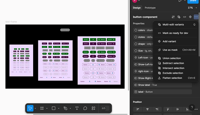
By the end of this tutorial, you’ll know how to create a dynamic, fully customizable button that lets you switch sizes, swap icons, change text labels, and even toggle the visibility of elements with Boolean properties. So, grab your coffee, sit back, and let’s break down this topic step by step.
- Why Component Properties Matter
- Figma UI 3 Redesign: What’s Changed?
- Step 1: Building the Base Button (Auto Layout Mastery)
- Step 2: Size Variants (SM, MD, LG) + Spacing Secrets
- Step 3: Color Properties (Primary, Secondary, Ghost, Disabled)
- Step 4: Shape Options (Rounded, Rectangular, Custom)
- Step 5: Icon Magic (Left/Right, Hide/Show, Instance Swap)
- Step 6: State Management (Default, Hover, Pressed)


