Member-only story
Responsive Design: Adapting to All Devices
15 min readNov 26, 2024
A. Mobile-first approach
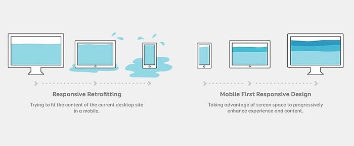
The mobile-first approach has become a cornerstone of responsive web design, and for good reason. With mobile devices accounting for over 50% of global web traffic, prioritizing mobile design is no longer optional — it’s essential. Here’s why the mobile-first approach is crucial and how to implement it effectively:

Why mobile-first matters
- User experience: Mobile users have different needs and behaviors compared to desktop users. By designing for mobile first, you ensure that the core content and functionality are optimized for smaller screens and touch interactions.
- Performance: Mobile devices often have slower internet connections and less processing power. A mobile-first approach encourages developers to focus on performance optimization from the start.
- Search engine optimization: Google uses mobile-first indexing, meaning it primarily uses the mobile version of a website for ranking and indexing. A well-designed mobile site can improve your search engine rankings.
- Future-proofing: As mobile usage continues to grow, designing with a mobile-first mindset ensures your website remains relevant and accessible to an ever-expanding mobile audience.
Implementing a mobile-first approach
To successfully implement a mobile-first approach, consider the following strategies:
- Start with the smallest screen: Begin your design process by creating layouts for the smallest screen sizes first, then progressively enhance the design for larger screens.
- Prioritize content: Identify the most critical content and features for mobile users and ensure they’re easily accessible on smaller screens.
- Use progressive enhancement: Add more complex features and visual elements as the screen size increases, rather than trying to cram everything into the mobile version.
- Optimize for touch: Design interface elements with touch in mind, using appropriately sized buttons and touch targets.
- Test extensively: Regularly test your design on various mobile devices and screen sizes to ensure a consistent…
